UX/UI Design Guide: How to Achieve Excellence in User Experience
Modern UX/UI design principles, user research, wireframing, prototyping, design system creation, accessibility standards and IPEC Labs product design processes.
The success of a software product is measured not only by its technical infrastructure, but also by how easy and enjoyable users can use it. You can have the world’s most powerful API, most robust database, and smartest algorithms, but if the user interface is complex, confusing, or aesthetically poor, users will abandon the product. As IPEC Labs, we share in this guide the UX/UI design experiences we have gained while developing products that appeal to different user profiles such as NŞEFİM restaurant management platform, NZeca AI assistant and Smart School Ecosystem.
Difference Between UX and UI
These two concepts are often used interchangeably, but they are fundamentally different. UX (User Experience) covers the entire interaction with a product: how the user discovers the product, how he learns, how he completes his tasks, and how he feels at the end. UX is understanding the user’s mental model and designing the product according to this model.
UI (User Interface) is the visual and interactive layer of this experience: colors, typography, buttons, icons, animations. UI is the concrete manifestation of UX.
To explain it with a restaurant analogy: UX is the restaurant’s menu structure, waiter service quality, table layout and ordering process flow. UI is the design of the menu, the interior decoration of the restaurant and the presentation of the plates. Both must be perfect.
User Research: The Beginning of Everything
The design process starts with the user, not the screen. IPEC Labs’ user research methodology consists of four stages.
The first stage is user interviews. While developing NŞEFİM, we held one-on-one interviews with dozens of restaurant owners, chefs, waiters and cashier personnel. The key insight from these interviews was this: restaurant workers feel varying levels of comfort with technology. The needs and expectations of an old cashier and a young waiter are completely different. For this reason, NŞEFİM’s interface was designed to be both touch screen friendly and minimally complex.
The second stage is observation studies. We observed how staff interacted with existing systems in real restaurant environments. The most valuable findings often come from what users do, not what they say. How many steps a waiter takes when taking an order, how many clicks it takes a cashier to complete a transaction, the readability of a kitchen display,these are observations that directly influence design decisions.
The third stage is persona creation. We created representative user profiles by synthesizing research data. We defined five core personas for MY CHEF: the tech-savvy business owner, the mid-level restaurant manager, the low-level cashier, the kitchen chef, and the franchise manager. Each persona’s goals, challenges, and technology skill level were defined in detail.
The fourth stage is user journey mapping. We mapped each persona’s interaction with the product from start to finish. All touchpoints have been identified, from initial registration to daily use, from problem solving to subscription renewal.
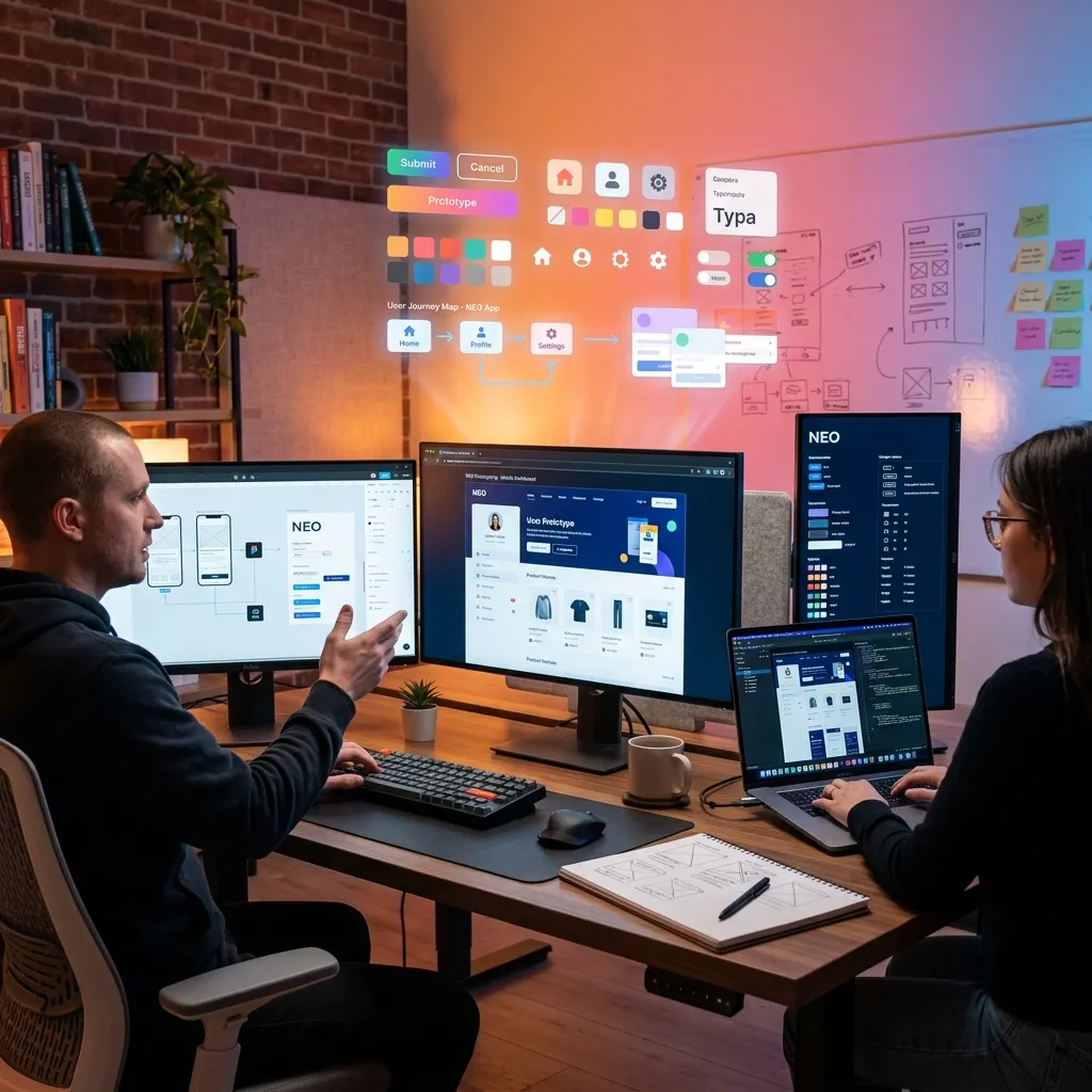
Wireframing and Prototyping
After the research is completed, the design process begins with low-fidelity wireframes. Wireframes are skeleton drawings that are devoid of aesthetic details and show only structure and flow.
NŞEFİM’s KDS (Kitchen Display System) wireframes were revised many times at this stage. The kitchen environment is chaotic: high temperature, noise, wet hands, fast pace. In these conditions, the interface should be large, clear and quickly readable. During the wireframe phase, we optimized font sizes, button areas and color contrasts according to kitchen conditions.
High-fidelity prototypes are versions of wireframes enriched with visual details. We create interactive prototypes using Figma. These prototypes are tested with real users and feedback is collected.
Prototype tests revealed very valuable findings for NŞEFİM. For example, initially the “Confirm” button for order confirmation was green. In testing, we discovered that kitchen staff accidentally tapped on the green button and confirmed orders that were not yet ready. As a solution, we implemented a swipe gesture for the confirmation button. The risk of accidental touching is eliminated.
Design System
Creating a design system is imperative to deliver a consistent user experience. The design system standardizes the color palette, typography scale, spacing system, component library, and interaction patterns.
IPEC Labs’ design system is called “Pulse” and is used in all our products. As for the color palette, each product has its own primary color, but auxiliary colors, warning colors and neutral tones are common. In this way, visual consistency between products is ensured, while the unique identity of each product is preserved.
We use the Inter font family for typography. This font is optimized for screen readability, has wide character support, and is legible at both small and large sizes. Typography scale is based on a mathematical ratio (1.25, Major Third).
The component library contains reusable UI components such as buttons, form elements, cards, modals, table components. Each component’s design tokens, accessibility requirements, and usage rules are documented.
Accessibility / a11y
Accessibility is not a luxury, it is a necessity. Compliance with WCAG 2.1 AA standards is targeted in all products of IPEC Labs.
Regarding color contrast, a minimum contrast ratio of 4.5:1 is achieved between text and background. For NŞEFİM’s kitchen screen, this ratio was increased to 7:1 because the lighting conditions of the kitchen environment were far from ideal.
Regarding keyboard navigation, all interactive elements should be accessible with the Tab key. Focus indicators must be clearly visible. NŞEFİM’s POS screen can be used entirely with the keyboard, cash register personnel can perform all transactions without using a mouse.
For screen reader compatibility, alt text is added to all images, labels are assigned to form fields, and ARIA attributes are used correctly.
Mobile-First Design
By 2026, more than seventy percent of internet traffic will come from mobile devices. That’s why our design process always starts with the mobile screen and expands to large screens.
Smart School parent application is designed entirely with mobile priority. Parents follow their children’s school status from their smartphones. Grade notifications, service tracking, canteen expenses and teacher messages - everything in one hand, on one screen.
NŞEFİM’s business owner application is optimized for both tablet and desktop use. While the business owner can review detailed reports from the desktop in the office, he can check the instant cash status from the tablet on the go.
Micro-Interactions and Animations
The details that make the user experience feel premium are mostly hidden in micro-interactions. A slight scaling animation on button click, success animation on form submission, smooth fade effect on page transitions, elastic feedback on pull-to-refresh movement, these little details make the product feel “alive” and “responsive”.
When a new order arrives at NŞEFİM, the notification card that appears on the screen is shown with a smooth entry animation and a noticeable color change. This micro-interaction prevents the new order from being overlooked in the busy kitchen environment.
Dark Mode and Themes
In 2026, dark mode is no longer a choice, but an expectation. All products from IPEC Labs offer both light and dark theme support.
Dark mode doesn’t just mean inverting colors. Dark gray tones are used instead of a pure black background because pure black causes a “smearing” effect on OLED displays. Shadows should be lighter in dark mode. Colors should be slightly desaturated in dark mode.
NŞEFİM’s kitchen screen uses dark mode by default because a dark background in the kitchen environment reduces eye fatigue and provides comfort for long-term use.
Performance and Perceived Speed
Perceived speed is as important as actual speed in user experience. Even if the page takes 2 seconds to load, if the user sees a skeleton screen, the waiting time is perceived as shorter.
Skeleton loading is actively used in the NŞEFİM dashboard. When the page opens, it first shows a skeleton of gray boxes, then the boxes fill with content as the actual data is loaded. This approach eliminates the user’s “page frozen” feeling.
Conclusion
UX/UI design is the bridge between technology and humans. Building this bridge strong, wide and beautiful is the key to the success of the product. As IPEC Labs, we meticulously apply our user-centered design principles in each of our products. Because we know that the best technology is the technology that the user uses without being aware of it.
Subscribe to our newsletter!